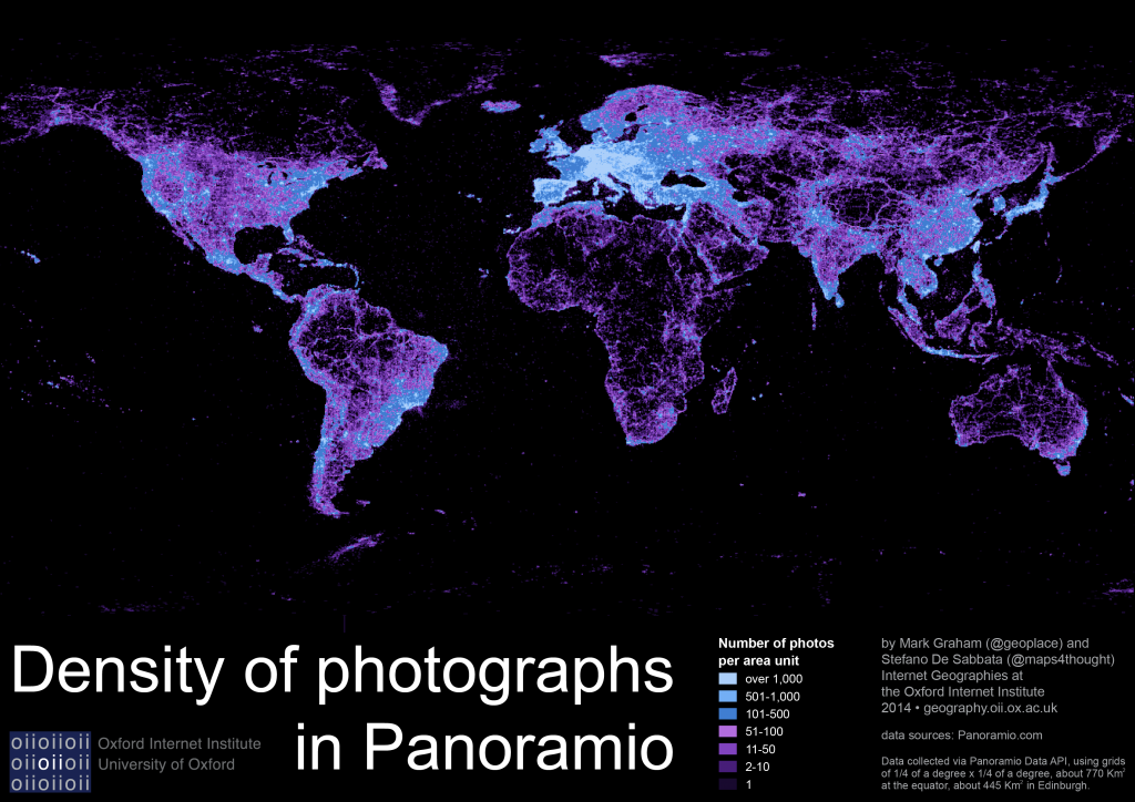
Building on our map of content in Flickr, this graphic tells a very similar story. Panoramio is smaller than Flickr, with about a tenth of its users, and only a fraction of its photos. Nonetheless, Panoramio plays an important role in online representations of places, as photographs on the site can be accessed as a layer in Google Maps and Google Earth.
Findings
The United States is layered with more than two million public photographs published on Panoramio. It is closely followed by Russia, China, Germany and Brazil, which are each covered with more than a million photos. These five countries account for about one-third of the entire public content on the platform.
However, it is the Netherlands that is covered by the densest layer of content, with over five pictures per square kilometer. The Netherlands are followed by Switzerland, Slovakia, Germany, and Belgium, which all have an average of three pictures per square kilometer.
In contrast, Africa in particular is characterised by very thin layers of digital content (Italy alone is covered by more photos than the whole continent). No African country has more than one picture per five square kilometers; the highest being Tunisia with 0.2 photos per square kilometer. Algeria is the country with the most photographs in Africa, but tiny Western Sahara has the fewest, representing just 0.016% of the content created about the United States.
Whilst Latin America and the Caribbean tend to score poorly on many other metrics of information production, they are represented by a non-trivial amount of content, with about as many photographs as the United States. In Asia, China accounts for the largest portion of pictures, followed by Turkey (with 800,000), and then Japan and India, each with about half a million pictures. The rest of Asia combined is described by about 1.8 million pictures.
These presences and absences all ultimately influence what we see, and where we see it, when using some of the web’s most popular platforms.
Data
The map uses data collected via the Panoramio Data API in December, 2013. We used the API to retrieve the number of public photos tagged to locations in each of 259,200 bounding boxes into which we divided the world. It’s worth noting that because our boxes are sized to be a quarter of a degree of latitude tall and a quarter of a degree of longitude wide, the mapped cells are not of a consistent size globally. A cell in Edinburgh has about half the area of a cell in Nairobi. This means that locations near the equator are more likely to show up as bright concentrations of content, compared to locations with equivalent numbers of photographs in higher or lower latitudes, although the used color-scale should limit this effect.
