Data
Many big technology companies have developed algorithms for providing query suggestions based on input to search fields and/or immediate feedback to users (see this, this, or this patent). These techniques are commonly referred to as autosuggest, incremental search or autocomplete. Google uses the latter name for its implementation in their Web search interface.
Google praises Autocomplete for “find[ing] information quickly by displaying searches that might be similar to the one you’re typing”. Google Autocomplete also relies on Google’s index of the Web, not just what users search for. Additionally, the Autocomplete results are also based on the user’s searches in the past if the user is signed in and the Web history feature is activated (we made sure this was not the case for this analysis), and on user profile data from Google+ (if the user is searching for a person).
The visualizations use geographic data and country names from Natural Earth. The official dataset contained United Kingdom as well as United States of America as country names. Great Britain, Britain and USA, US were added to these (the former case reflects a common point of confusion). Using a Python script, Google.com was queried for all countries with the term: “why [is/are] [the] (country x) so”. Queries thus encompassed, for example: “why is Kenya so“, “why are the Philippines so“, “why is the United Kingdom so“, etc. The phrasing of this crude and somewhat naïve query is meant to reflect what people may find remarkable, great, sad, annoying, surprising, or unknown about a country.
We found suggested questions that are driven by what seems to range from curiosity, compassion, and travel experience to naivety, politics, badmouthing and propaganda – in other words, the results reflect the whole range of human motivations and intentions; the best and the worst in us. The results that we get from Google.com further indicate that the data powering Autocomplete suggestions are probably largely taken from Western users, and thus likely fail to reflect the inputs of information searchers in other parts of the world.
Before mapping, the retrieved data needed to be cleaned up due to semantic issues. Results that seemed to represent a category mistake due to semantic ambiguity of a country name were removed entirely: a prime result being Turkey that yielded responses referring to poultry such as “high in Sodium”, “good for you”, “expensive this year”. Similar semantic ambiguities arose for example for:
- “Why is Chad on so random”, “why is Chad Ochocinco so bad”: referring to an American football wide receiver,
- “Why is chili so good/hot/addictive”,
- “Why is guinea pig so called”,
- “Why is Jersey so tacky/trashy”: likely referring to the TV show Jersey Shore set in New Jersey, rather than Jersey, the British Crown Dependency,
- “Why is Kuwait Airways so cheap”, “why is Sri Lankan so expensive”: referring to airlines
These semantic mismatches were removed from the data.
Findings
Google stresses that “Autocomplete predictions are algorithmically determined […] without any human intervention”. Furthermore, the user base (and thus the training dataset) of Google Autocomplete is massive, since it is built into Google Web search in a way that it cannot be turned off by users.
Google may not give Autocomplete suggestions for search terms that are (for example) not popular enough or that became popular too recently, or when the query matches a “narrow class of search queries” about “pornography, violence, hate speech, and copyright infringement” (see also here). Despite these disclaimers and attempts at regulation, Google Autocomplete has spurred legal proceedings and complaints in various countries (for instance by the owners of a hotel in Ireland, the German former First Lady, two individuals whose names were associated with crimes and supporters of the US politician Pat Buchanan). Most recently, Google Autocomplete has been a means of campaigning for UN Women. Those adverts use Google Autocomplete with queries such as “women cannot “ or “women should “ to demonstrate sexism and discrimination against women that is built both into our societies and into our information environments.
Although we have no way of opening the black box of Google’s Autocomplete algorithm, by mapping its results we can peer into some of the variable representations of different parts of our world that they choose to suggest to their users. In what follows we highlight Google Autocomplete mappings of several properties – from physical, through the socio-economic, to the whimsical.
Physical Properties
Google Autocomplete associates many countries with either hot or cold. Interestingly, Thailand is the only country associated with both categories. The semantic ambiguity of the word “hot” (temperature-related versus the meaning of “receiving much interest or attention”) potentially affects parts of the result.

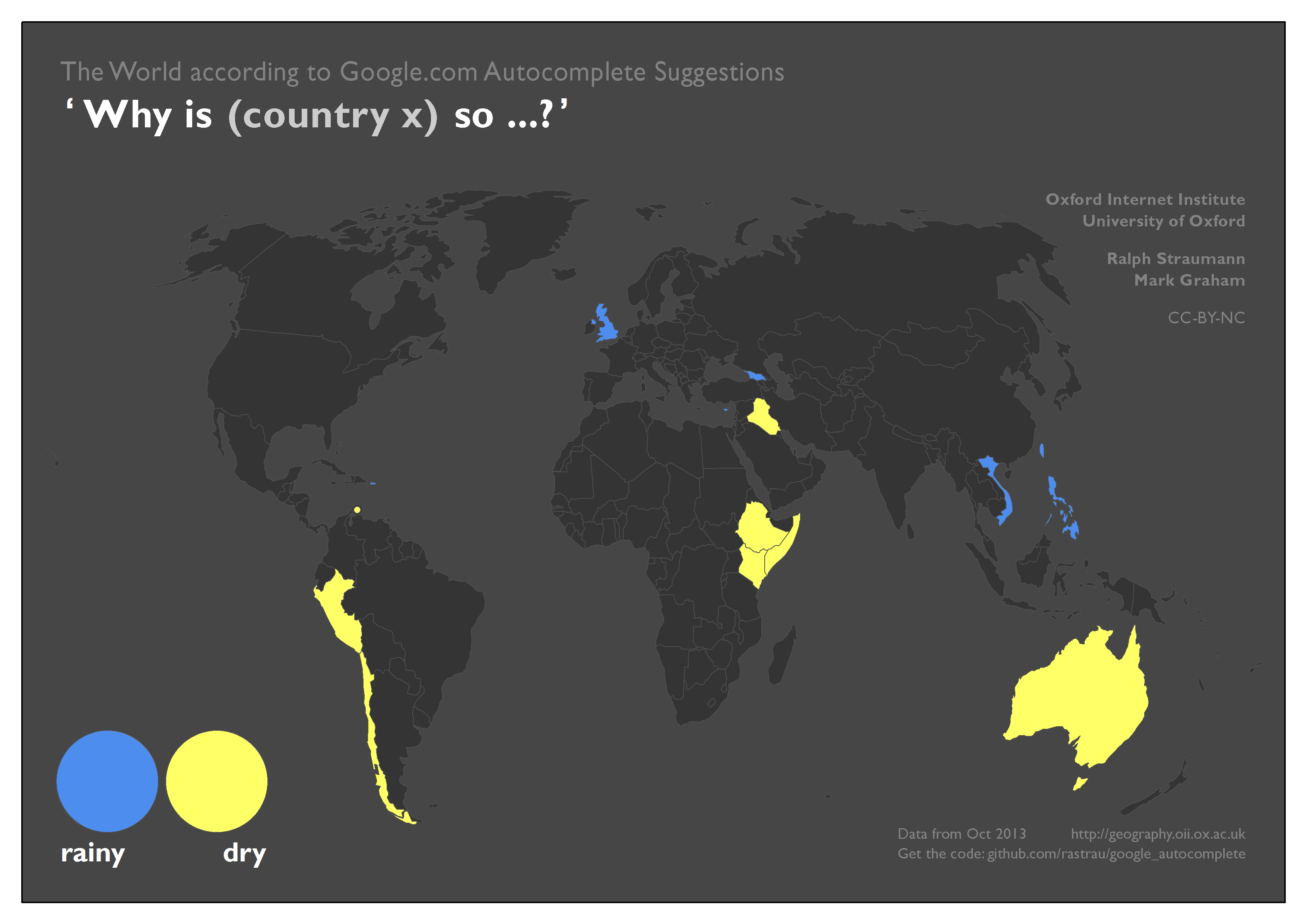
The countries associated with rainy or dry in the next map pose little surprise. The mapping of big and small, however, shows some interesting patterns: Oddly, people seem to wonder about the large size of the, in reality, very small Vatican City State. Conversely, Mongolia seems to appear surprisingly small to many people, whilst people ask why the United Kingdom is both small and big.
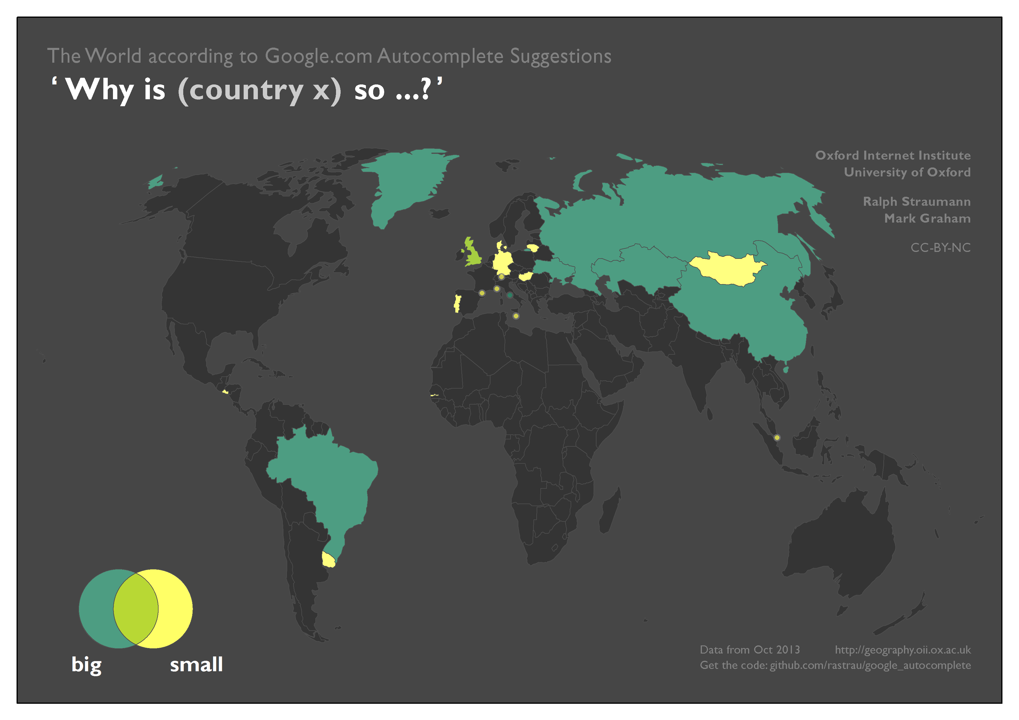
Mostly, European countries seem to get considered in a global context (at the European scale, Germany, for example, would probably not be considered small by anybody). However, with the same frame of reference it would be hard to conceive why Mongolia is considered small. We think the most plausible explanations are that users either compare Mongolia with its rather large neighbours (China, Russia, Kazakhstan), or that users compare present-day Mongolia to the historically much larger Mongol Empire.
Finally, Greenland is an interesting case: it’s associated with both big and the more specific big on the map. This is likely a consequence of the abundance of Web maps in the so-called Web Mercator projection (for example, Google Maps) which are particularly ill-suited to adequately depicting the sizes of geographic objects near the poles. It seems likely that the size of Greenland as perceived by users is indeed vastly bigger than its actual size. (Note, the compromise Winkel Tripel projection we use in our maps still overstates Greenland’s size.)
Economic and Sociodemographic Properties
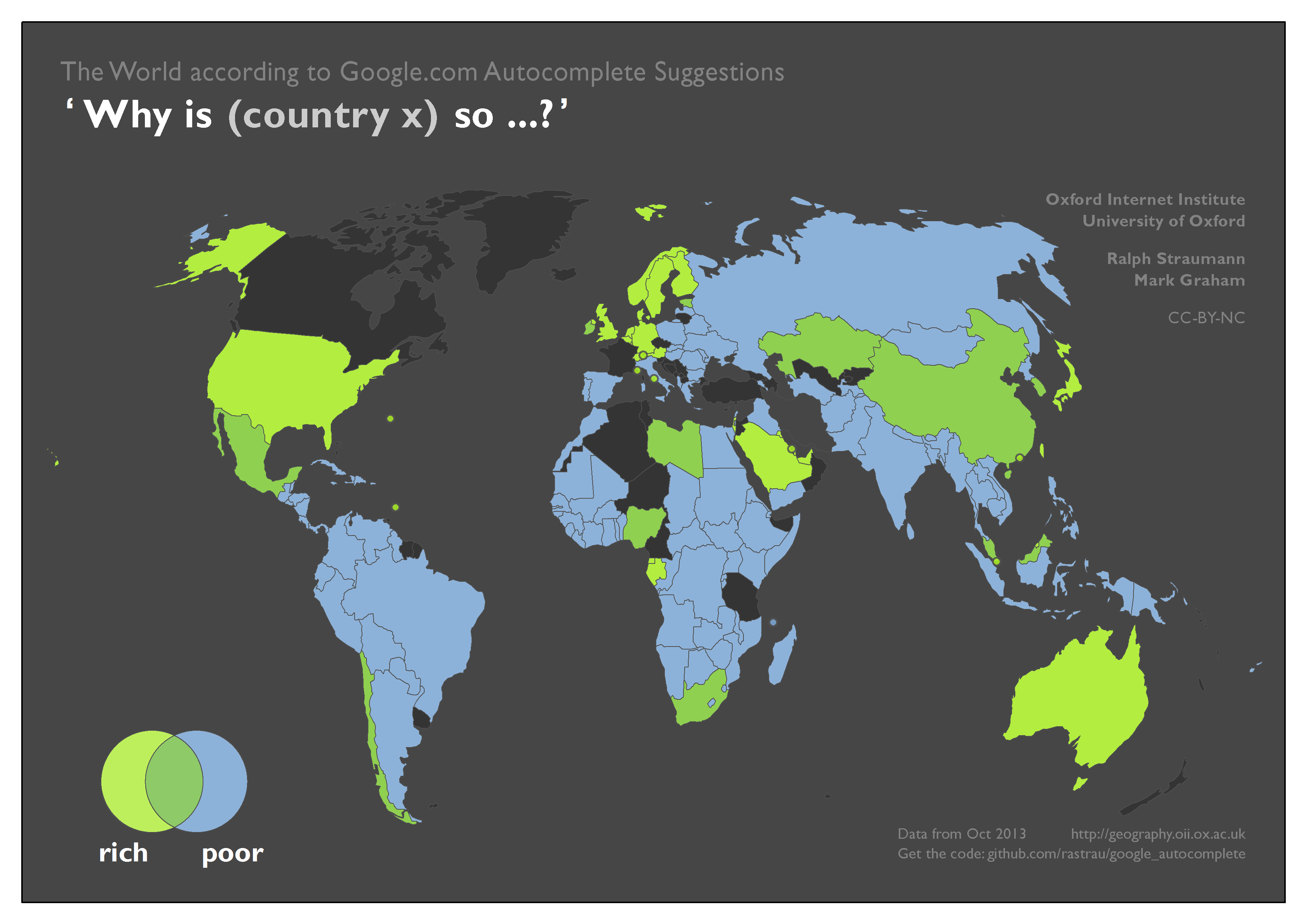
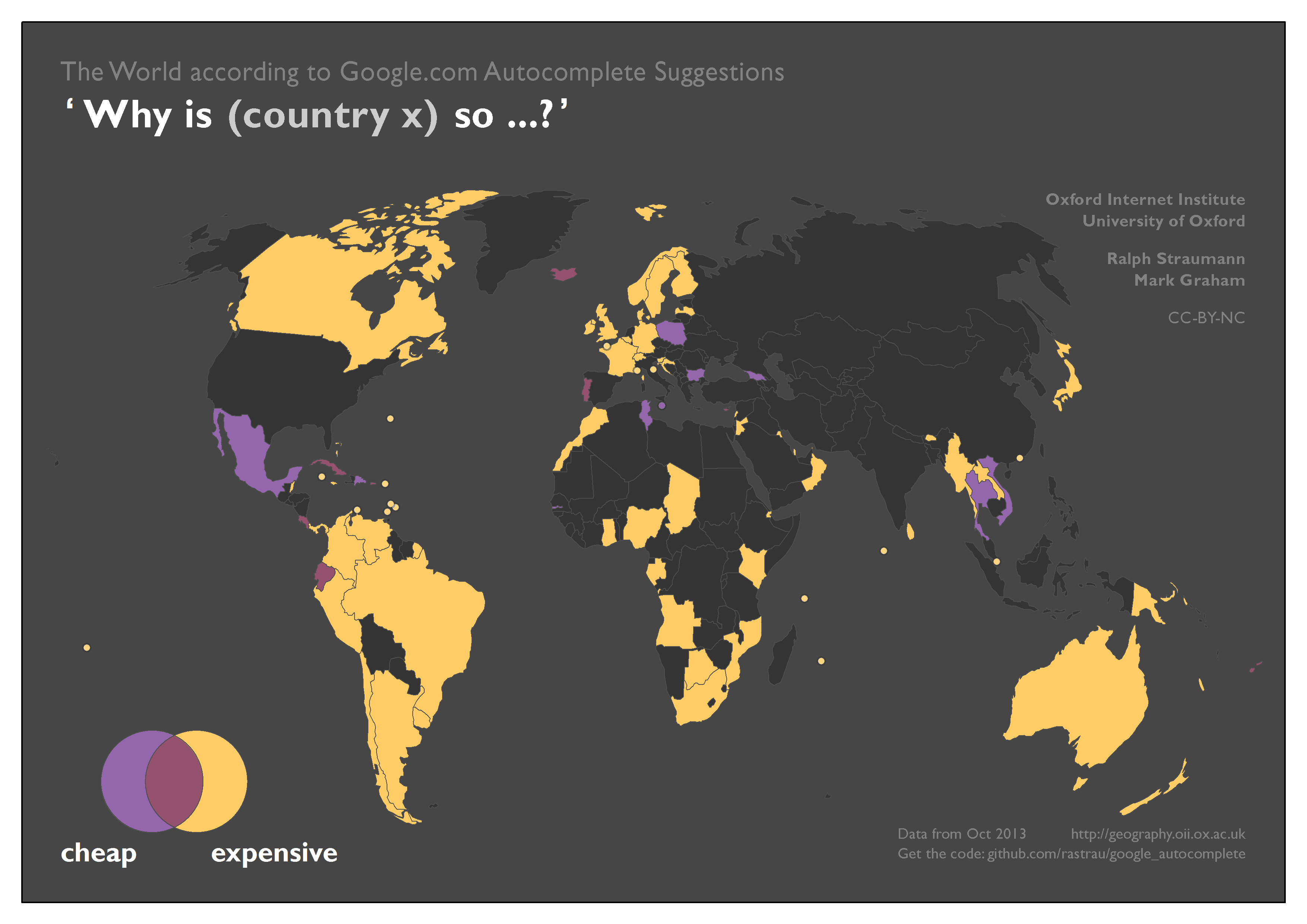
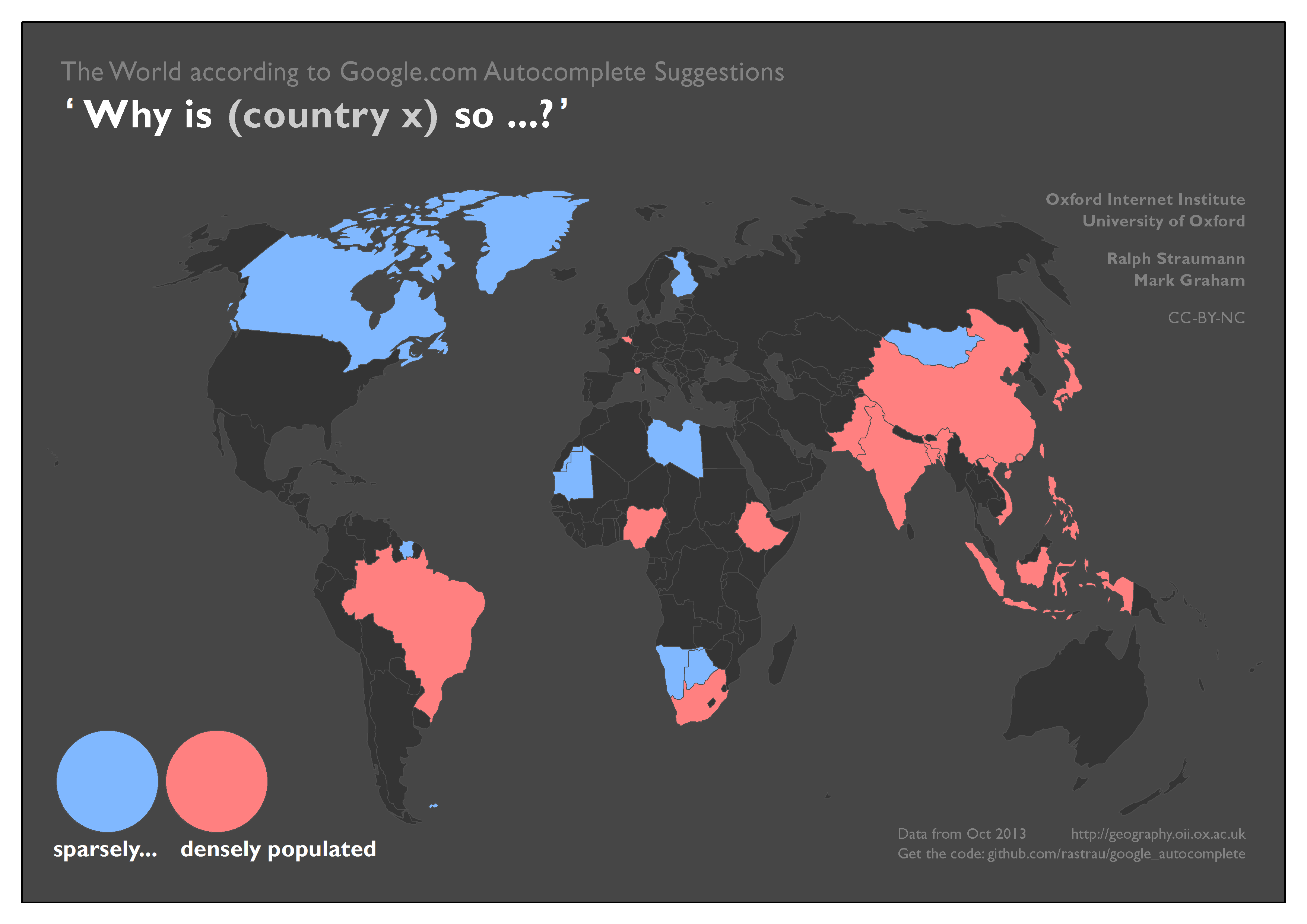
In the next set of maps, we looked at wealth (“rich” vs “poor”), cost (“cheap” vs “expensive”), and population density (“sparse” vs “dense”). From the results we get a sense that – similarly to physical size – some of these characteristics are also considered with a range of frames of reference in mind (global, regional, national, local). Additionally (in the absence of data to confirm or disprove), one can conjecture that the home country of Web users phrasing the questions at hand may also play a role in associating certain properties with a country, i.e. the associations might also have a relational characteristic.

These conflicting frames of reference may well be responsible for the surprisingly substantial overlap between poor and rich. For example, Mexico, Ireland, Egypt, Nigeria, South Africa, or China might be considered relatively affluent in comparison to some countries and poor compared to others.
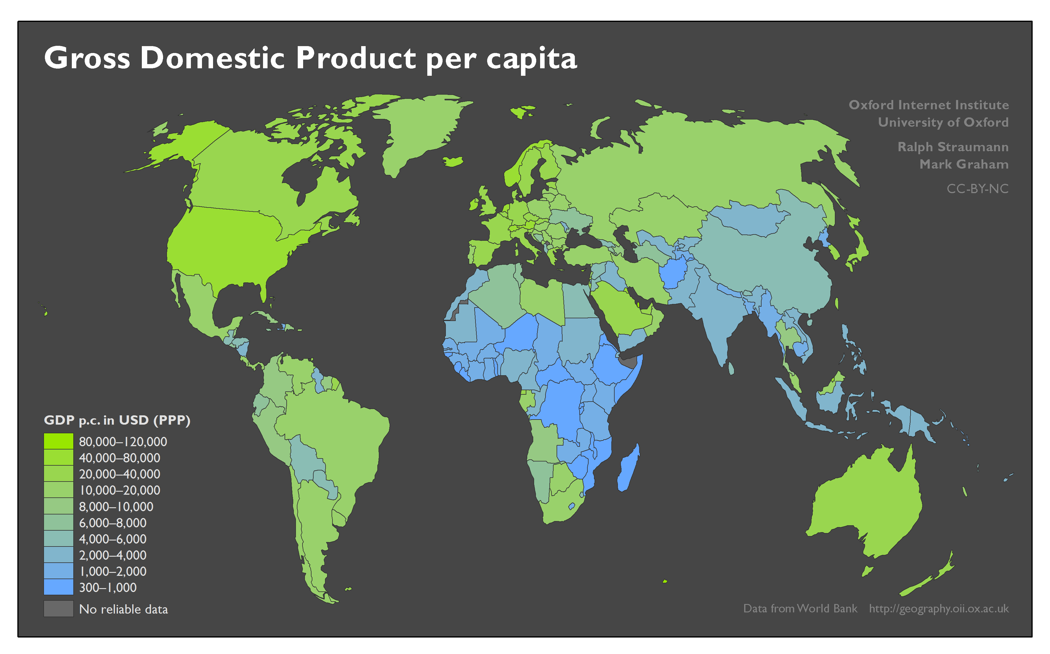
If we compare the poor–rich associations to the ‘ground truth’ of GDP per capita, there is general alignment, but also some notable differences: for example, in the Autocomplete results, one of the fault lines in Europe follows the border between the former Warsaw Pact and “Western Europe”. The map of GDP per capita, however, puts these countries – globally – in the quite wealthy categories. China is being considered both rich and poor, while Russia is only viewed as poor. But based on GDP per capita, Russia fares better economically than China.
We suggest very similar mechanisms of reference frames and simplifying assumptions are at play in the associations with affordability (cheap–expensive) and with population density. That is, Google results largely mirror underlying geographic data, but with exceptions.

…and the rest
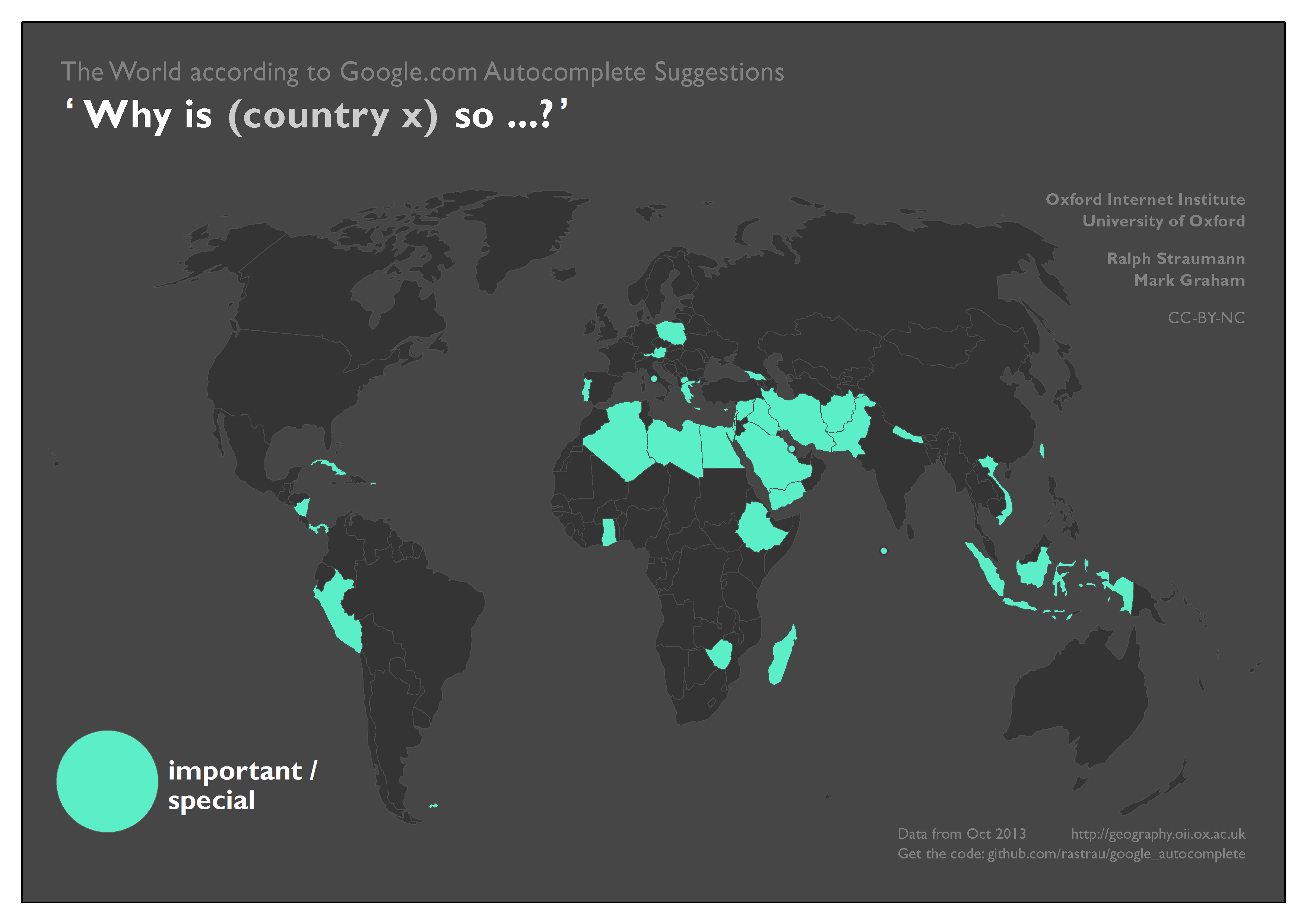
Finally, we can map the subjective and sometimes whimsical associations Google gathers from Web users and feeds into Autocomplete: Important/special, in the map below, could partially be a rough reflection of a combination of news coverage of (mostly) relatively small countries, combined with an audience of searchers keen to find out more about those places.
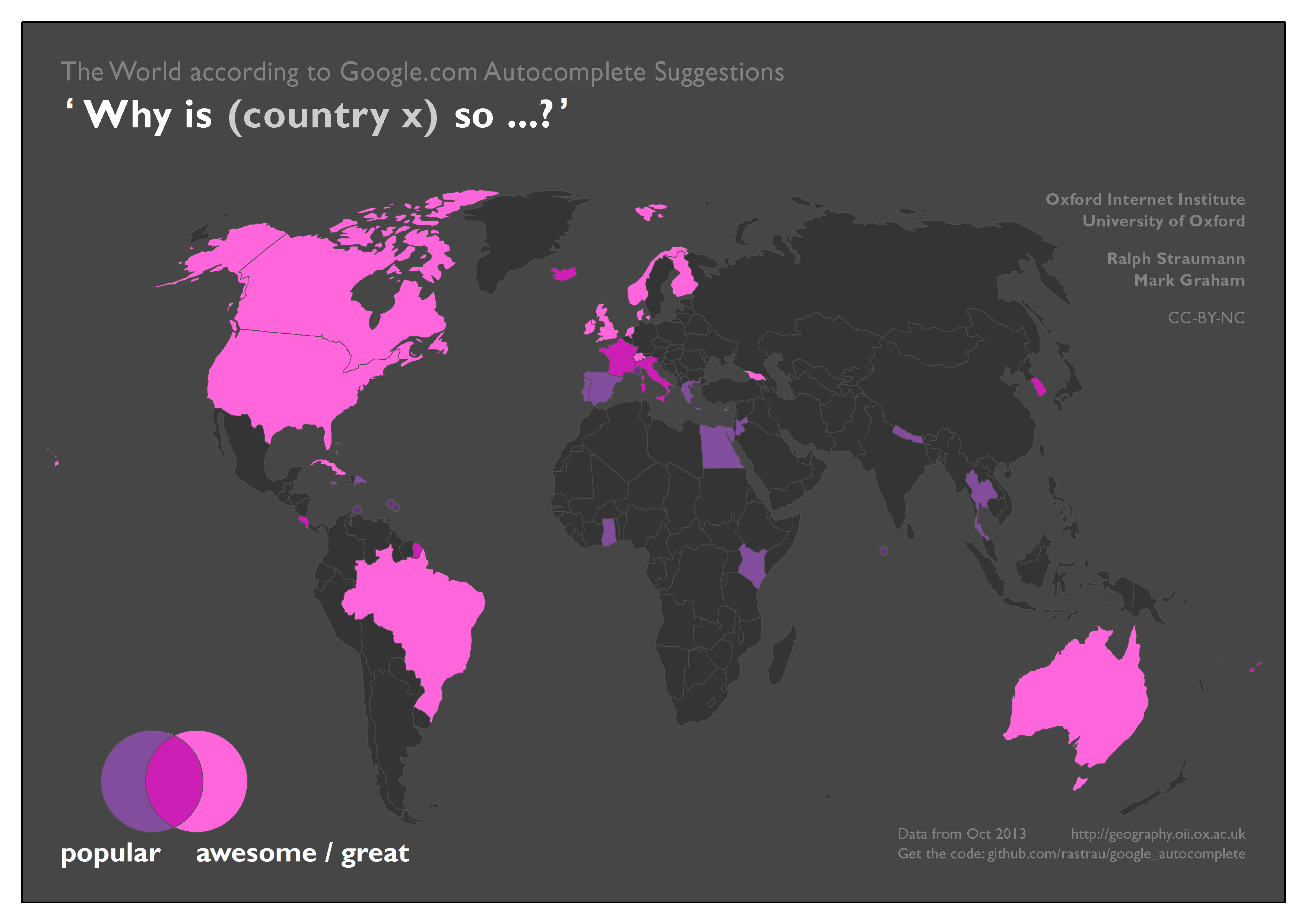
In the map below, Fiji, South Korea, Costa Rica, Iceland, France and Italy are all associated both with being popular, and awesome or great. Disappointingly, the United Kingdom (remember, we also queried for “Great Britain”) earns its association with the awesome / great category with the somewhat circular question “why is Great Britain so great?”.
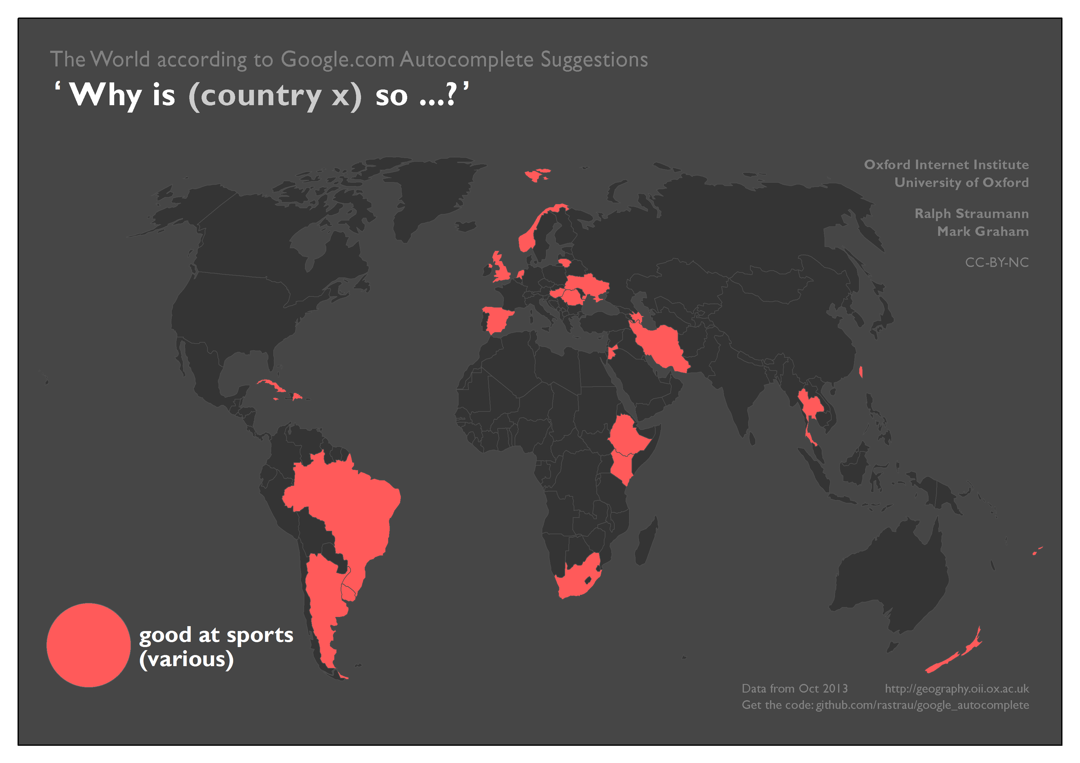
Autocomplete also proposes that Web users seem to think that a few countries are particularly good at sports. We generalised these results; Autocomplete was happy to specifically point out (for example) the prowess of Cuba in baseball and boxing, Azerbaijan in wrestling, and Iran in weightlifting.
Finally, Autocomplete suggests, albeit with limited coverage, that countries are either powerful or happy, but not both.

These maps ultimately show us some of the ways that Google’s algorithms are presenting our world back to us. In most cases, the information given to us reinforces existing patterns (e.g. “why is Norway so rich?”, “why is Mongolia so sparsely populated?”, “why is the United Kingdom so rainy?”). However, in a few cases we see somewhat puzzling results (e.g. “why is Ireland so hot?”, “why is Mongolia so small?”). Not knowing the full extent of the data sources and mechanisms of this implementation of a query suggestion algorithm, we can only hypothesize that the more puzzling results might originate from a mix of distinct frames of reference when phrasing questions (and in the specific case of size, the effects of map projections) and, partly, semantic ambiguity.
Some whimsical results should not lead us to underestimate the potential negative effects of such query suggestion algorithms: on the whole, we ultimately see a service that offers us geographic information in a way that can both reduce serendipity and reinforce filter bubbles. We are encouraged to access specific kinds of information about a country that is similar to information requested (or discussed) by millions of others.
In the case at hand, the query suggestion’s impact is further amplified by Google Instant, a functionality that immediately shows users results as soon as they hover over one of the suggestions made by Google Autocomplete. Search manipulation, and Google bombing, is another practice that undoubtedly influences information presented to users with Google Autocomplete.
Thus, Google Autocomplete certainly has the promise of making Web search faster and easier, but we can also see some of the ways that the company has the power to assist in disseminating clichés and stereotypes held by its user base and described or debated on webpages contained in Google’s search index.
Further reading
Davisson A (2013): Google Search and the development of Public Opinion. Journal of Digital and Media Literacy.
Baker P & Potts A (2013): ‘Why do white people have thin lips?’ Google and the perpetuation of stereotypes via auto-complete search forms. Critical Discourse Studies 10(2): 187–204.