Flickr is one of the world’s most popular photo sharing websites, and represents a key way in which people form impressions about different parts of our planet. In other words it is an important part of the digital augmentations of places.
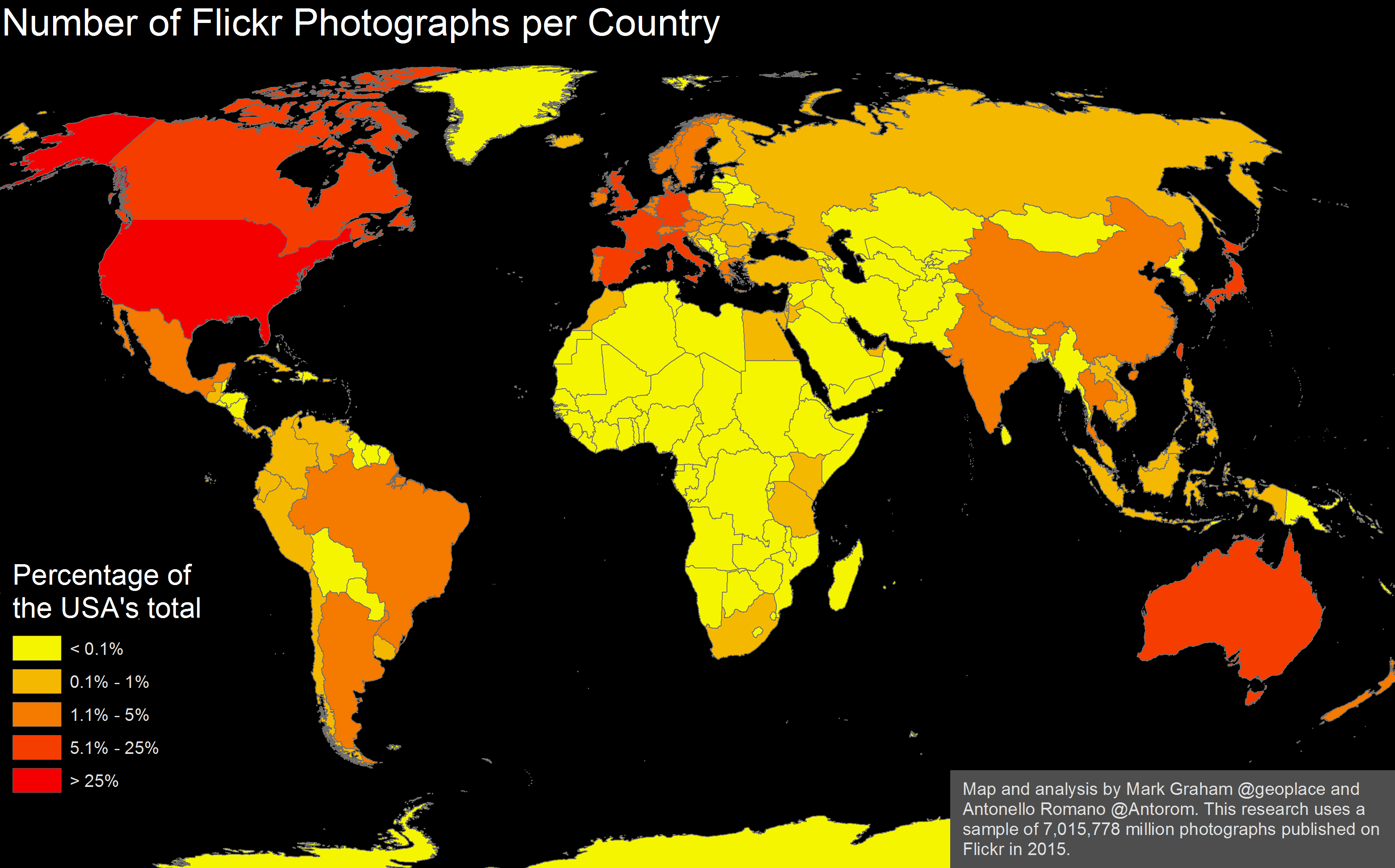
Antonello Romano has been doing some great work mapping content from the site, and I’ve pulled some of his data together into this map. What we see are huge differences in the amount of images augmenting different parts of the world. To anyone familiar with some of our previous research, this will be unsurprising. But it is again perhaps the scale of some of these differences that never ceases to astound.
I’ve shaded each country as a percentage of the USA’s total rather than as absolute numbers, so that this digital information inequality can be better visualised. You can see, for instance, that there are only five countries in Africa that have more than 0.1% of the USA’s total number of photos about them.
These geographies of information matter: they shape what is known, and what can be known about a place. And even in our age of connectivity, large parts of the planet remain left off the map.
(map originally posted on Mark Graham’s blog)
Pingback: A map of Flickr photos shows the World digital divide - cittadini di twitter